Marketing software is a collection of digital technologies that assist businesses in executing, managing, and analyzing marketing campaigns to increase their efficacy and efficiency.
Increased customer engagement and conversion rates result from its automation of tedious operations, comprehensive analytics, customer segmentation capabilities, and targeted content distribution systems.
People in the marketing departments of huge organizations who want to simplify their marketing plans and small business owners who want to expand their brands are among the users of this program.
According to user reviews and ratings, the top marketing software includes:
1.
Omnisend
4.7 (413)
Omnisend is an e-commerce marketing automation platform designed to help merchants streamline their marketing processes by offering advanced email marketing, SMS messaging, and automation tools aimed at increasing sales without requiring a significant increase in workload.
Launched in 2014, Omnisend is an eCommerce marketing solution designed to help online businesses improve their marketing efforts. It offers a comprehensive platform that provides users with tools for email marketing, SMS marketing, and automation. The software aims to simplify the marketing process and improve customer engagement for eCommerce merchants. With a commitment to innovation...
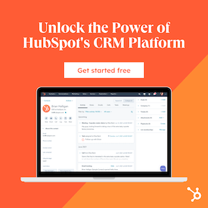
HubSpot CRM is one of the most popular sales management solutions with all the features to manage your contacts and pipeline effectively. So, if you are looking for a tool to manage your business along with your team, HubSpot CRM is undoubtedly one of the best options for you. No matter how big or small...
If you are serious about social media marketing for your business, you must know about PromoRepublic. This is a social media marketing platform with over 100,000 post ideas and templates to choose from. You can use PromoRepublic to design your posts and schedule your posting. So, in a way, this tool will completely automate the...
if you are looking for the best blogger outreach tools, Ninja Outreach is one of the top options available in the market. Ninja Outreach is one of the most effective tools that simplify your task of finding guest post opportunities and networking with social media influencers for your keyword. It organizes all the information that...
Marketing software is a technology that essentially helps businesses with efficiency when it comes to achieving their marketing goals. This software is designed to enable users to create, manage, and track marketing campaigns across various channels.
Marketing software’s main objective is to streamline tasks, review marketing data, and improve businesses’ marketing campaigns to see better results.
How Does Marketing Software Support Business Operations?
Marketing software supports business operations by utilizing automated tasks to improve time management within the business. This software easily integrates with other business systems (like customer relationship management (CRM)) to present a full customer data perspective.
This enables businesses to keep track of their marketing campaign results, improve on marketing weaknesses, and make better decisions based on customer behavior. Marketing software can also improve teams’ time management with functions like task assignment, scheduling, and progress tracking tools.
What Are the Core Functions of Marketing Software?
The core functions of marketing software are to optimize and simplify many facets of marketing strategies. These tools maximize interaction, customize client interactions, and offer useful information to support smart marketing choices. The core functions of marketing software include the following:
Automation of marketing tasks: This includes email scheduling and scheduled social media posts, which ensures consistent engagement with the audiences.
Lead generation: This tool helps to gather and organize leads from various sources.
Segmentation and nurturing: This tool is used to maintain communication with different audience segments.
Analytics and reporting: This function provides insights into campaign performance, customer behavior, and ROI.
What Are the Different Types of Marketing Software?
Different marketing software tools range from customer relationship management systems and automation platforms to analytics dashboards and content management systems, each serving a unique purpose in the digital marketing ecosystem. The different types of marketing software are listed below:
Type
Definition
Best for
Email Marketing Software
Email marketing tools enable creating, sending, and tracking of email campaigns.
Creating and automating email campaigns. Gathering leads, sending newsletters, and tracking engagement.
Social Media Management Software
Social media management tools facilitate scheduling, monitoring, and analyzing social media content.
Streamlining social media marketing efforts.
Marketing Automation Software
Marketing automation tools automate repetitive tasks and increases task efficiency.
Lead nurturing, email workflows, personalized messaging, and campaign workflows.
Customer Relationship Management (CRM) Software
Manages and tracks customer relationships. It helps sales teams stay organized and provides insights into customer behavior.
Managing customer interactions, tracking leads, and nurturing relationships. Records of interactions, follow-ups, and customer life cycle stages.
Search Engine Optimization (SEO) Software
Software that analyzes keywords, backlinks, and site performance.
Enhancement of website visibility and performance in search engine results.
Content Management Software (CMS)
Software that manages digital content. Simplifying content creation and publishing.
Managing website content, blogs, and landing pages. Enhanced content creation, publishing, and SEO optimization.
Which Type of Marketing Applications Is Most Suitable for Your Business?
The most suitable type of marketing application for your business will depend on your business goals. To determine the appropriate option, you should consider aspects such as your marketing objectives, target audience, and operational requirements.
If you aim to maintain customer relationships and nurture leads, CRM and email marketing software are the best options. However, social media management tools and SEO software are more suitable if you wish to improve your online presence and engage customers.
Marketing automation systems would be the most fitting choice for businesses that want to streamline their marketing tasks.
What Are the Pros and Cons of Each Type of Marketing Solution?
The pros and cons of each type of marketing solution depend on factors such as the target audience, budget, business goals, and the specific industry context. Understanding these can help businesses leverage the right tools effectively while navigating potential obstacles. The pros and cons of each type of marketing solution are listed below:
Email Marketing Platforms
Pros:
Cost-effective.
High ROI.
Cons:
Requires regular content creation.
Overuse can lead to spam.
Social Media Management Tools
Pros:
Enhanced engagement.
A Good way to gather customer insights.
Cons:
Needs constant monitoring.
It can be a costly option.
Marketing Automation Systems
Pros:
Increases efficiency.
Scales marketing efforts.
Cons:
It can be costly.
Requires comprehensive planning.
CRM Software
Pros:
Centralizes customer data.
Improves customer relationships.
Cons:
It can be complex to implement.
Requires thorough training.
SEO Tools
Pros:
Improves website visibility.
Drives organic traffic.
Cons:
Requires ongoing effort.
Time-consuming.
Content Management Systems
Pros:
It makes content creation and management easy.
Improves collaboration,
Cons:
It is a complex system that may require technical skills.
Limited customization option.
How Are Integrated Marketing Platforms Different from Specialized Tools?
Integrated marketing platforms differ from specialized tools in that they offer a comprehensive suite of marketing functions within a single solution. This allows seamless integration and data sharing across different marketing activities.
In short, specialized tools help with specific aspects of marketing, such as email marketing, where in-depth features and capabilities in that particular area are utilized. Integrated platforms are an all-in-one solution, with functions for various needs.
What Are the Free and Open-Source Alternatives to Commercial Marketing Software?
The free and open-source alternatives to commercial marketing software include solutions like Mailchimp, Zapier, and Hotjar. The free and open-source alternatives to commercial marketing software provide businesses with cost-effective solutions for marketing tasks.
These programs come with tools for sending emails, managing social media accounts, keeping track of customers, and analyzing data. With open-source software, you can customize the code to fit your specific needs, giving you more control over your marketing strategy.
What Are the Best Free Marketing Software Solutions?
The best free marketing software solutions like Mailchimp, Zapier, Hotjar, and Amplitude, promise to elevate your marketing game without stretching your budget, offering a variety of features from email marketing to SEO optimization. The best free marketing software solutions are listed below:
Software Name
Key Features
Best for
Mailchimp
Email marketing, automation, and analytics.
Growing email marketing program.
Zapier
Automated workflows known as Zaps, compatible with thousands of tools, can chain commands together with an “If X happens, do Y” structure.
Automating repetitive tasks and integrating different tools in your marketing stack.
Hotjar
Website heatmaps, and visitor behavior analysis.
Understanding how users interact with your website.
Amplitude
Provides good analytics and data understanding.
Data collection and analysis.
Yoast
SEO optimization for WordPress.
Improving your website’s SEO.
Google Analytics
Website intelligence, and traffic data analysis.
Understanding website traffic and user behavior.
What Are the Top Open-Source Marketing Programs Options?
The top open-source marketing program options include Matomo, Mautic, Ghost, Strapi, and Agnitas. The top open-source marketing programs offer flexibility and customization, allowing businesses to tailor their marketing efforts precisely while fostering a community-driven approach to software development. The top open-source marketing programs include:
Matomo: An open-source web analytics software platform.
Mautic: A powerful tool for marketing automation.
Ghost: An open-source publishing platform.
Strapi: An open-source headless CMS.
Agnitas: An open-source email marketing software.
Mailtrain: A self-hosted newsletter application built on Node.js.
Listmonk: A self-hosted open-source software.
Odoo: A suite of open-source business apps.
ERPNext: An open-source ERP.
Baserow: An open-source no-code database tool.
How Do Free and Open-Source Marketing Tools Compare to Paid Solutions?
Free and open-source marketing tools compare to paid solutions in terms of cost-effectiveness, community support, and customization possibilities, but they may lack in areas like user experience, advanced features, and dedicated customer support.
Businesses can now use free and open-source software as alternatives to costly marketing software. These programs contain features like email sending, social media account management, customer tracking, and data analysis.
By using open-source software, businesses have the option to modify the code to match their specific requirements, which leads to greater control over their marketing strategy.
How Can Businesses of Different Sizes Benefit from the Best Marketing Platforms?
Businesses of different sizes can benefit from the best marketing platforms through tailored strategies, scalability, and access to a variety of tools that can drive customer engagement, increase brand visibility, and ultimately boost sales. Here are the key benefits for each size of business:
Business Size
Key Benefits
Small Businesses
Cost-Effectiveness: Small businesses can increase their local market exposure by using social media platforms like Facebook, Instagram, and Google My Business. Targeted Reach: To get the most out of your advertising, consider using targeted advertising on Facebook and Google Ads. These platforms give you the ability to reach potential customers based on their demographics, behaviors, or contact information. This type of advertising can be especially helpful for businesses that offer niche products or local services. Analytics and Feedback: Make data-driven decisions by analyzing customer behavior and preferences through tools like Google Analytics and social media insights. Community and Relationship Building: Small businesses can use social media management tools like Hootsuite or Buffer to handle interactions, grow community, and build customer loyalty.
Medium-sized Businesses
Scalability: Medium-sized businesses can benefit from using marketing platforms like HubSpot or Salesforce, which offer scalable solutions to help them manage and grow their marketing efforts. Diversified Marketing Strategies: Medium-sized businesses may allocate budgets to both PPC campaigns using Google AdWords and SEO strategies for sustainable traffic growth. Customer Segmentation and Personalization: Medium-sized businesses can improve engagement rates by using tools like Mailchimp or Marketo to segment audiences and send personalized emails. Integrated Marketing Solutions: Medium-sized businesses often require an integrated marketing solution to manage multiple channels and campaigns. Platforms like Adobe Marketing Cloud offer an all-in-one solution for advertising, content management, and data analysis.
Large Enterprises
Brand Reach and Reputation Management: Large corporations rely on platforms such as Brandwatch for reputation management and Hootsuite for social media management to oversee their global brand presence across various regions and languages. Advanced Data Analytics: Large enterprises can invest in advanced analytics tools like Google Analytics 360 and Adobe Analytics, which offer deeper insights into customer behavior. These tools enable predictive analytics and help businesses make informed decisions. Market Expansion and Global Reach: Large businesses benefit from platforms like LinkedIn for B2B marketing or Google Ads for reaching new international markets. Automation and Efficiency: Large businesses can automate repetitive tasks, streamline marketing processes, and ensure consistent customer experiences across multiple channels with the help of automation tools like Marketo or Eloqua.
How Do You Choose the Right Marketing Software?
To choose the right marketing software, it’s important to understand your business needs, objectives, and processes. Start by checking your marketing strategies and resources and identify any challenges you want to tackle with the software. The right marketing software should be in line with your overall business goals and enhance your marketing efforts effectively.
What Factors Should Influence Your Selection of Marketing Platforms?
The selection of marketing platforms should be influenced by factors such as your business goals, target audience, budget, the specific features you require, and the level of customer support provided by the platform. Factors that should influence your selection of marketing platforms include:
Business Objectives: When you’re planning out your marketing strategy, it’s important to set some clear goals. This way, you can figure out what features your marketing software needs to help you reach those goals.
Features and Functionality: Before choosing a platform to market your product, make sure you check out all the features of each one and see if they’ll work for you. It’s important to make sure the platform you choose is the right fit for you.
Usability and Integration: Check if the platform can work with your current systems and tools. Also, make sure the platform is user-friendly.
Scalability: Make sure the software you pick can handle your business’s future growth. You don’t want to be stuck with something that won’t keep up with your needs.
Budget: Determine your marketing software budget and consider the initial investment and ongoing costs.
How to Assess Your Business Needs Against Marketing Software Capabilities?
Assessing your business requirements against the capabilities of marketing software is essential to ensure that the tool fits your current needs and supports your growth and evolution. To assess your business needs against marketing software capabilities you will need to follow the following steps:
Conduct a Marketing Audit: Look at yourcurrent marketing activities and performance and identify gaps and improvement areas.
Identify Key Requirements: List essential features and functionalities your business needs to achieve goals and overcome marketing challenges.
Match Needs to Features: Compare your requirements with the features offered by different marketing software solutions.
Request Demos and Trials: Test different software platforms to get a feel for what they offer and if they are user-friendly enough for your team.
Seek Feedback: Include the relevant team members in the testing process to ensure the software’s suitability.
How Does Marketing Software Integrate with Other Business Systems?
Marketing software is often integrated with other business systems using APIs (Application Programming Interfaces), webhooks, or direct software integrations provided by the software vendors.
These integrations allow marketing software to share data with CRM systems, email platforms, social media channels, e-commerce platforms, and analytics tools. This way, data can flow smoothly between marketing and other business functions.
It ensures better coordination between different departments, provides personalized customer experiences and generates accurate analytics.
What Are the Potential Challenges in Integrating Marketing Software with Existing Systems in 2024?
Integrating new marketing software with existing systems can present challenges, requiring careful planning and execution. Potential challenges in integrating marketing software with existing systems include:
Data Silos: Incompatible systems or data formats can lead to isolated data pools.
Technical Limitations: Some systems may have limited integration capabilities or lack the necessary APIs.
Resource Constraints: Integrating systems can require significant time, technical expertise, and financial resources.
Data Security and Compliance: Ensuring that data transfers between systems are secure and comply with regulations like GDPR or CCPA can be complex and require careful planning.
Maintenance and Updates: Integrated systems need regular maintenance and updates, which can disrupt existing workflows and require ongoing attention.
What Are the Pricing Models for Marketing Software?
Pricing models for marketing software vary widely depending on the provider, the software’s capabilities, and the scale of the user’s marketing operations. Common pricing models include:
Subscription-Based: Users pay a monthly or annual fee based on the level of service, number of users, or other factors.
Freemium: Providers offer a basic version of their software for free, with limited features or capacity. Users can upgrade to paid plans for more advanced features or higher usage limits.
Pay-Per-Use: Users pay based on their actual usage of the software, such as the number of emails sent, the volume of web traffic analyzed, or the number of leads generated.
Tiered Pricing: Prices are set based on tiers or levels of service.
Perpetual License: Users pay a one-time fee to use the software indefinitely.
What Are the Potential Hidden Costs or Fees Associated with Marketing Software?
Beyond the sticker price, marketing software may carry hidden costs or fees, which businesses need to consider to avoid unexpected budget overruns. Potential hidden costs or fees associated with marketing software include the following:
Setup and Onboarding Fees: Providers might charge an initial fee for setting up your account or onboarding your team.
Add-Ons and Upgrades: Basic plans may require additional payments for extra features, integrations, or increased capacity.
Training and Support: In-depth training or premium support services may cost extra.
Data Migration: If you’re switching from another system, there may be costs associated with transferring your data to the new software.
Cancellation Fees: Some contracts may include fees for early termination or downgrading from a higher-priced plan.
How Do the Pricing Models of Different Marketing Software Providers Compare?
Marketing software providers offer a variety of pricing structures, each with its implications for cost-effectiveness and scalability. Here is a comparison of pricing models of different marketing software providers:
Provider
Pricing Model
Starting Price
HubSpot Marketing Hub
Subscription-Based
$800 per month/ 3 seats
Monday.com
Tiered Pricing/Subscription
$9 per seat per month
Semrush
Tiered Pricing/Subscription
$129,95 per month
Maropost
Tiered Pricing/Subscription
$251 per month
Mailchimp
Tiered Pricing/Subscription
$6 per month
What Security and Compliance Features Are Important in Marketing Software?
In today’s world, security and compliance features in marketing software are non-negotiable, safeguarding sensitive customer data and ensuring adherence to regulatory standards. Important security and compliance features in marketing software include:
Data Encryption: This ensures your data is encrypted both in transit and at rest, protecting sensitive information from unauthorized access.
User Authentication and Authorization: These functions ensure that only authorized users can access certain data or functionalities.
Audit Trails: Detailed logs of user activities and data changes, which are crucial for monitoring and investigating suspicious activities.
Regular Security Updates and Patches: Regular updating and patching of vulnerabilities of the software.
Data Backup and Recovery: This function prevents data loss in case of a security breach or system failure.
Compliance with Regulations: Ensure that the software complies with relevant regulations such as GDPR, CCPA, and HIPAA, which govern data protection and privacy.
Who Are the Leading Providers of Marketing Software?
The leading providers of marketing software include HubSpot, known for its comprehensive customer lifecycle tracking, in the second quarter of 2023, they expected their non-GAAP operating income to be in the range of $293.0 million to $297.0 million, with non-GAAP net income per common share ranging from $5.24 to $5.29, showing significant growth and financial performance over recent periods.
Another leading provider is Semrush, known for its robust SEO and marketing analytics. Their fourth-quarter revenue of 2023 was $83.4 million, marking a 21% increase year-over-year.
Klaviyo is another leading provider, known for marketing automation. Klaviyo reported a 48% year-over-year growth in the third quarter of 2023, showcasing significant expansion.
Lastly, Pardot by Salesforce, renowned for its B2B marketing automation features. They reported a 14.5% growth rate in 2023 showing they are still one of the leading providers of marketing software.
What Makes These Marketing Software Providers Stand Out in the Market?
What sets leading marketing software providers apart is often a blend of innovative features, robust support, user-centric design, and a strong track record of delivering results. These marketing software providers stand out due to the following:
Integration Capabilities: Systems seamlessly integrate with other business systems, including CRM, e-commerce platforms, and social media channels, making it easy to manage your operations.
User-Friendly Interfaces: Easy-to-use tools and intuitive dashboards so that marketers of all skill levels can succeed. By simplifying the process, marketers can focus on creating effective campaigns.
Scalability: Catering to businesses of all sizes, allowing for growth and expansion without the need to switch platforms.
Strong Customer Support: Offering a range of support services, including training, documentation, and customer service.
Innovation and Continuous Improvement: They keep their offerings up-to-date with the latest technologies and marketing practices.
How Is Marketing Software Evolving with Current Tech Trends?
Marketing software is becoming more advanced by utilizing new technologies such as artificial intelligence (AI), machine learning, big data analytics, and integration capabilities. These technologies make marketing software smarter and more personalized.
AI and machine learning help to forecast customer behavior, automate content creation, and optimize campaign performance. Additionally, big data analytics provide greater insights into customer preferences and market trends, further enhancing.
What Future Developments Are Anticipated in the Marketing Software Industry?
The marketing software industry is poised for exciting developments, promising to redefine how businesses connect with their audiences. Future developments that are anticipated in the marketing software industry include:
Greater Personalization: AI and data analytics are advancing to create highly personalized marketing experiences. This means that content and campaigns will be tailored to individual customer preferences and behaviors.
Enhanced Automation: Marketing software is becoming more self-sufficient by being able to handle complicated tasks and decision-making processes. This means that there will be less need for manual intervention.
Voice and Visual Search: As more people use voice and visual search technologies, marketing software will change to make sure content and campaigns work well with these new types of searches.
Augmented Reality (AR) and Virtual Reality (VR): Brands can engage customers and offer immersive experiences by integrating AR and VR technologies. The combination of these technologies will provide innovative ways to create memorable experiences for customers.
Blockchain Technology: Blockchain technology can enhance transparency and security in managing data within marketing software. As more businesses adopt it, they may benefit from better data management practices.
What Are the Potential Disruptors in the Marketing Software Market?
Emerging technologies and changing consumer behaviors are potential disruptors in the marketing software market, challenging established norms and opening new avenues for innovation. Potential disruptors in the marketing software market include:
Decentralized Platforms: Blockchain and decentralized tech can revolutionize marketing by improving customer data and privacy management.
Consumer Data Privacy Regulations: As data privacy regulations, like GDPR and CCPA, become more stringent, marketing practices and software capabilities may face challenges that could require privacy-centric solutions.
New Communication Channels: Marketing software needs to adapt to new communication platforms and social media channels to keep engagement across different platforms. This may require continuous updates to maintain audience interest.
AI Ethics and Bias: AI is increasingly important in marketing software. However, ethical issues and biased AI algorithms could cause regulatory challenges and change public perception.
Quantum Computing: Although still in its early stages, quantum computing has the potential to revolutionize the way we handle data and can help us to analyze and interpret it more effectively.
Recent Product Reviews
Freshdesk
BeginDot Score | 94%
Freshdesk is a customer enagement solution powered by...


 (1)")